Back to Home

Kid Commerce Research Archive

Not all of my research made it into the final case study. This archive shows the raw inputs, exploratory sketches, and everything that contributed to the final decisions. I'm sharing it to demonstrate my process, not polish.
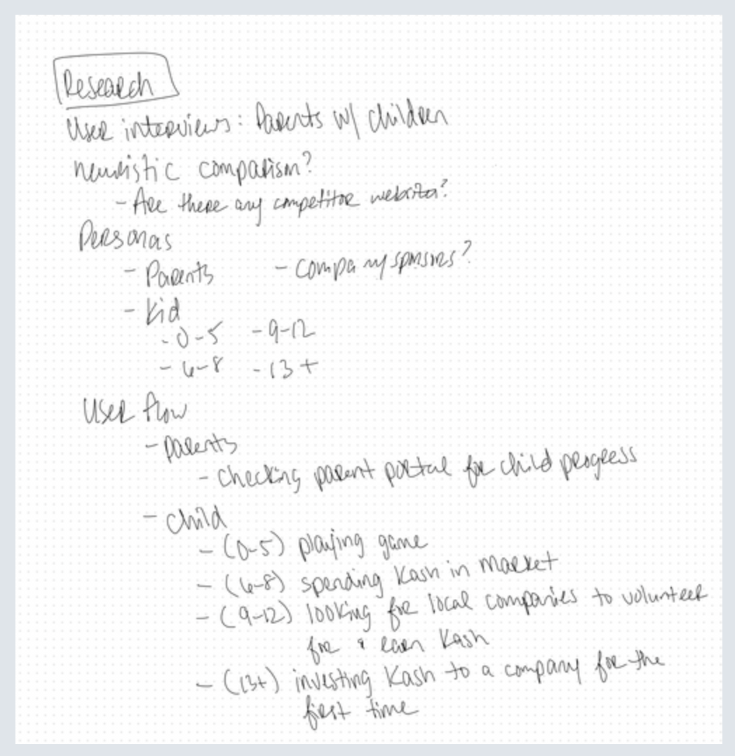
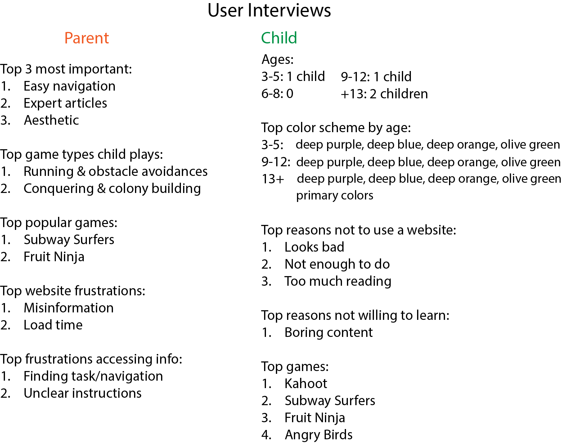
User Interviews
User interviews with the parents and kids clarified what parents value in their children's financial learning and what keeps young users engaged online, especially in online educational envirornments.
User interview summary comparing parents and children on website navigation, game preferences, frustrations, and color schemes by child age.
User interviews with parents and kids before design
Table showing five users with icons, each marked for completing 'Making a credit line payment' and 'Create & edit a recurring transfer' tasks, all expecting to find spending under the June pie chart.
User interviews after redesign
Early Research and Discovery
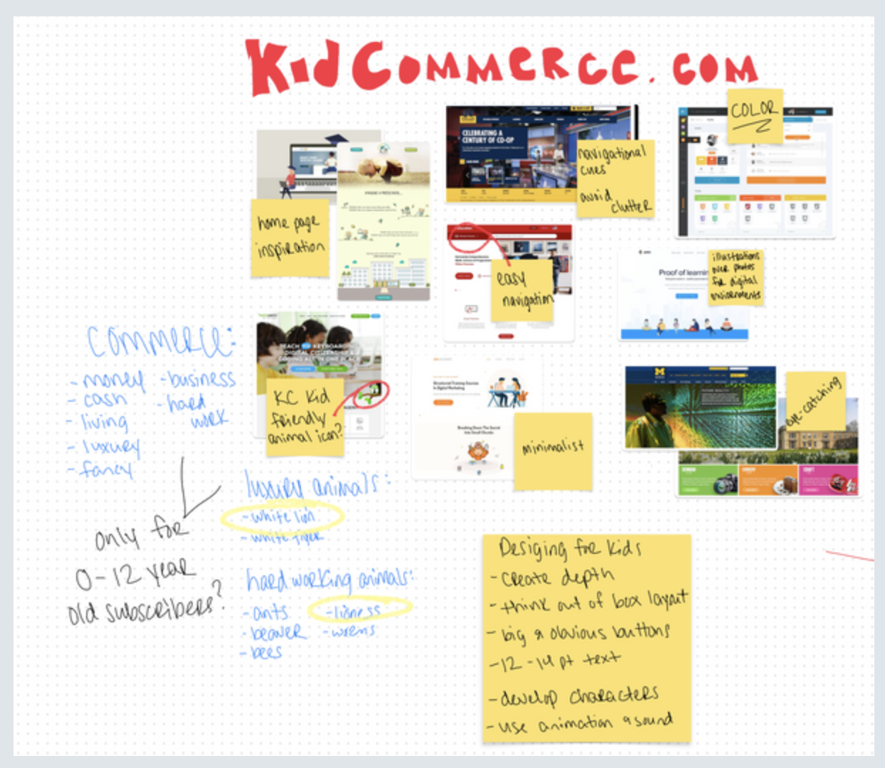
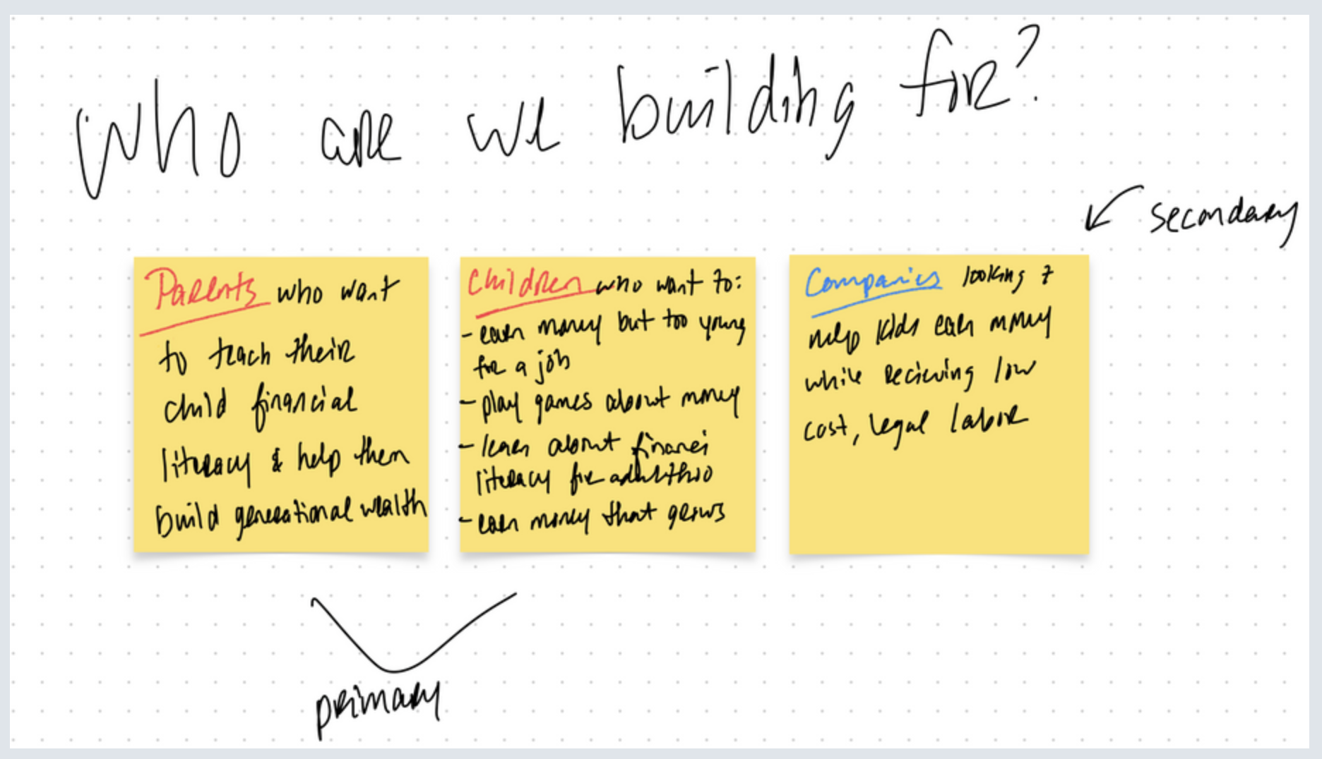
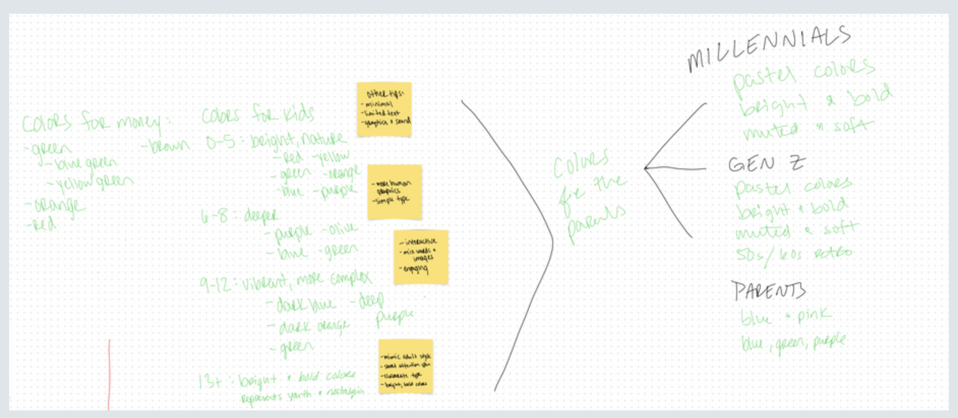
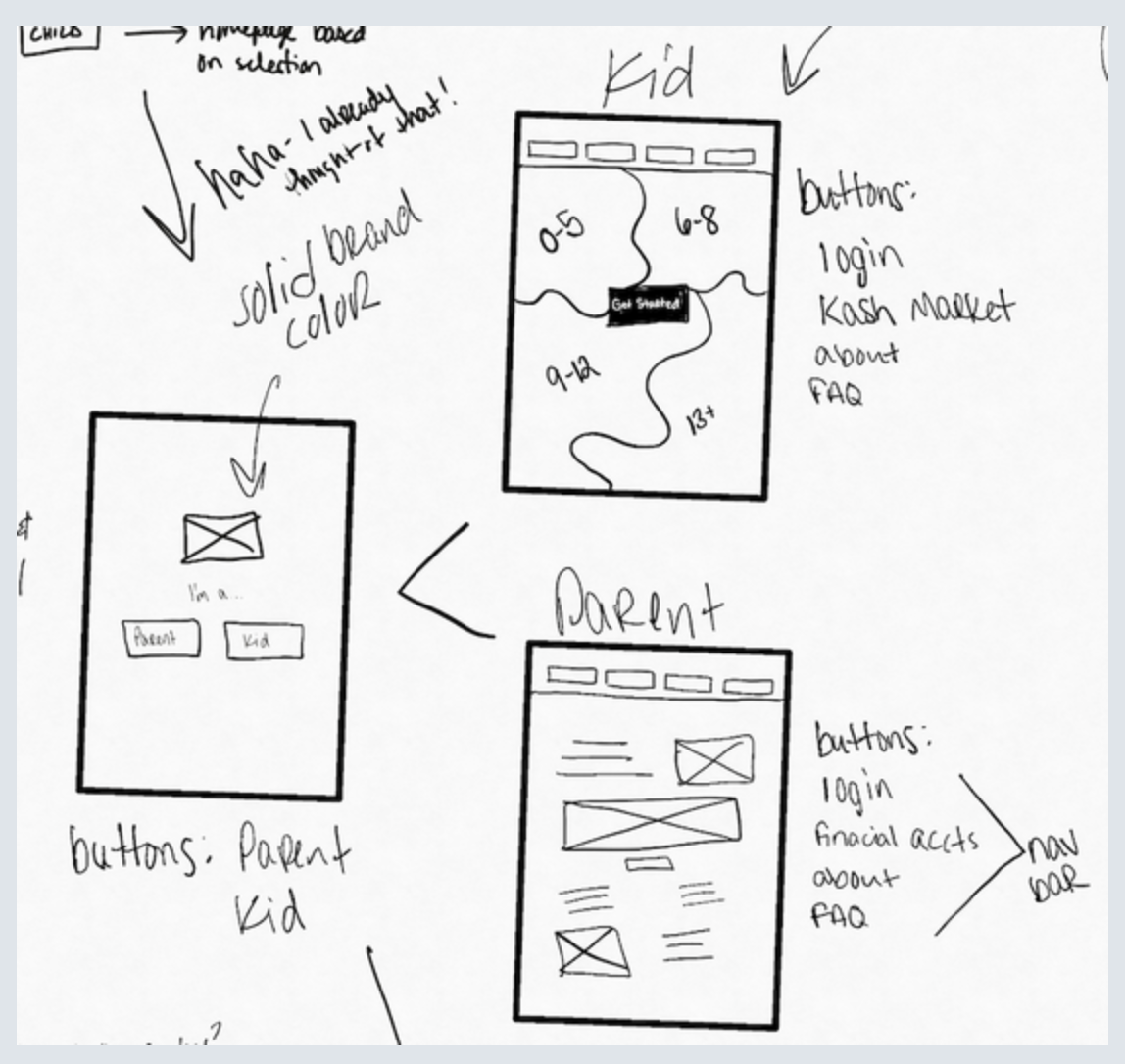
Early discovery work shaped a brand that could resonate across all ages groups and revealed the need to separate the into multiple platforms to accomadate the special needs of each group.
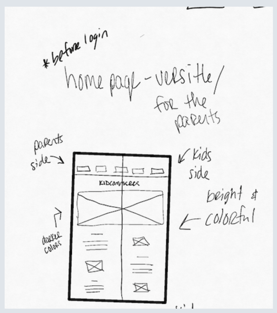
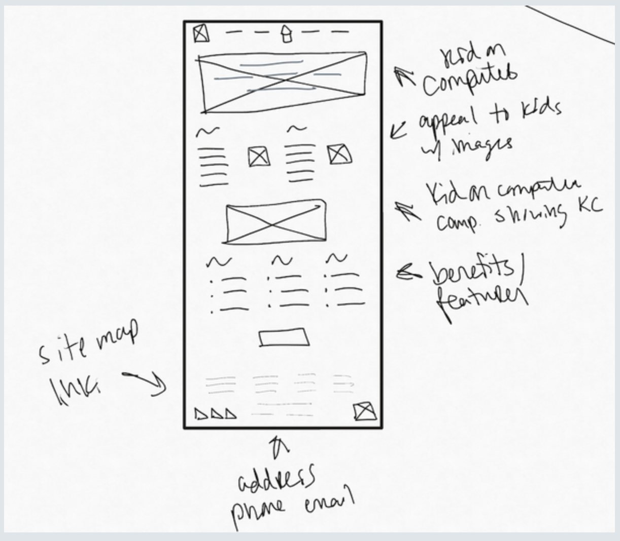
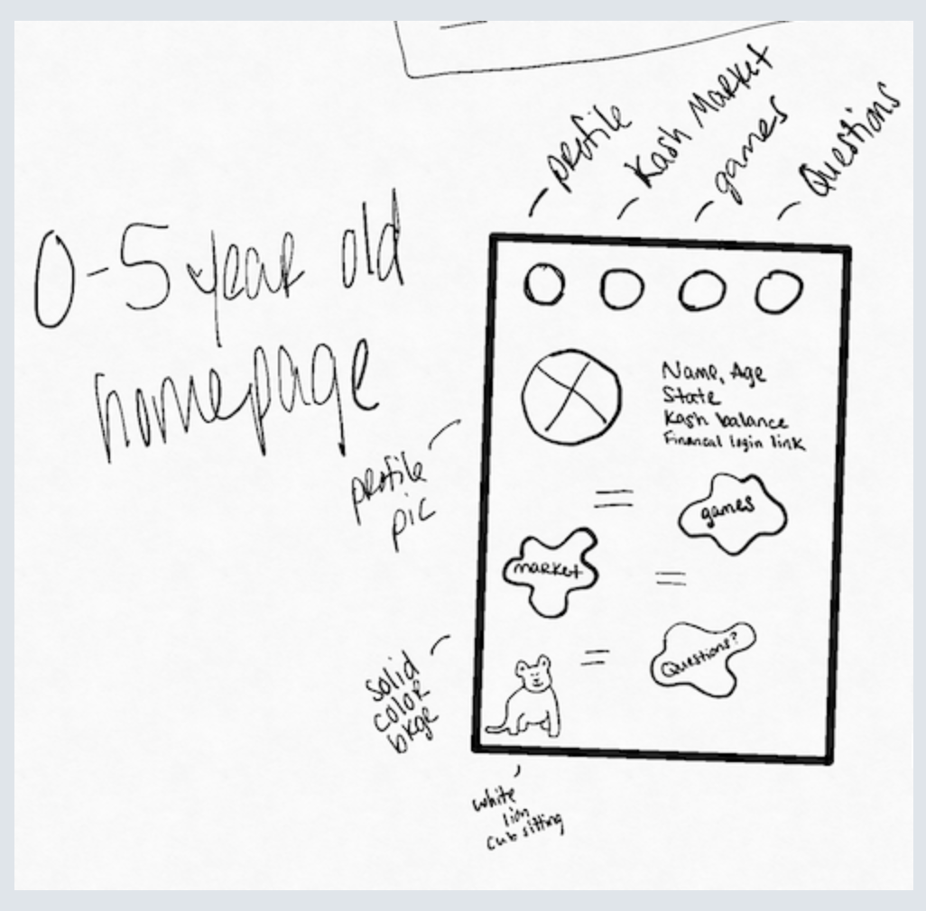
Handwritten research notes outlining user interviews with parents and children, heuristic comparison questions, personas by age groups, and user flow steps for parents and children. KidCommerce.com website brainstorming board with screenshots, sticky notes on design ideas, navigation, colors, kid-friendly icons, and notes on commerce concepts and animal themes. Handwritten notes on three yellow sticky notes under the question 'Who are we building for?'. The first note labeled 'Parents' describes parents wanting to teach their child financial literacy and build generational wealth. The second note labeled 'Children' lists children wanting to earn money but too young for a job, play games about money, learn about financial literacy, and earn money that grows. The third note labeled 'Companies' mentions companies looking to help kids earn money while receiving low cost legal labor, marked as secondary audience. Handwritten mind map titled 'Colors for the parents' showing color preferences for different age groups including kids, millennials, Gen Z, and parents with color names and notes in green and black ink on dotted grid paper.
Brainstorm Sketches
These hand-drawn sketches and iterations helped me explore the platform's structure and ensure it remained user-friendly, intuitive, and responsive to our user's unique needs.
Hand-drawn wireframe sketch of a homepage divided into two sides: parents side with darker colors and kids side with bright and colorful design, labeled as before login. Hand-drawn website wireframe sketch showing a header image, three content sections with text and images, notes highlighting kid-friendly design, computer camp themes, benefits/features, sitemap links, and contact information placeholders. Hand-drawn website wireframe sketches showing a selection screen with Parent and Kid buttons, and separate layout ideas for Kid and Parent pages. Hand-drawn sketch of a homepage layout for ages 0-5 featuring a profile pic, icons for market, games, and questions, and notes about profile details and a cute sitting white lion illustration.
scroll to top arrow