IKEA stores average 300,000 square feet. Finding what you want, confirming it fits your space, and actually getting to it are three separate problems. I designed a unified AR ecosystem that solves all three without pulling you out of the experience.
This is how I did it...
This is how I did it...
IKEA stores average 300,000 square feet. Finding what you want, confirming it fits your space, and actually getting to it are three separate problems. I designed a unified AR ecosystem that solves all three without pulling you out of the experience.
This is how I did it...
This is how I did it...
IKEA
An AR navigation and shopping experience
MY ROLE:
Designer, UX Researcher
TIMELINE
4 weeks
2026

IKEA
An AR navigation and shopping experience
MY ROLE:
Designer, UX Researcher
TIMELINE:
4 weeks
How might we extend IKEA's existing app experience with an AR ecosystem that helps shoppers find products in-store, visualize them in their space, and make confident purchase decisions without adding complexity to an already feature-heavy app?
Process for IKEA
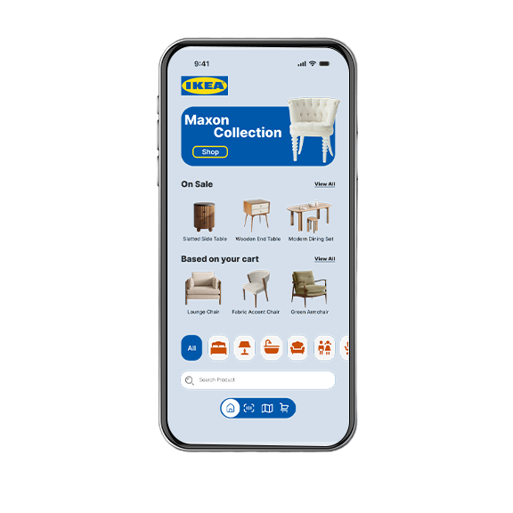
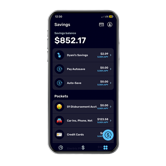
The Original Design
Research
The Missed Opportunities
1. Shoppers rely on printed maps and aisle signage in a 300,000 sq ft environment.
2.The scan feature requires a barcode. Unlabeled products are unidentifiable.
3. No way to visualize a product before buying; returns follow.
2.The scan feature requires a barcode. Unlabeled products are unidentifiable.
3. No way to visualize a product before buying; returns follow.
1. No in-store AR navigation
Shoppers rely on printed maps and aisle signage in a 300,000 sq ft environment.
2. No product recognition
Existing scan feature requires a barcode or QR code. Shoppers who spot an unlabeled product or display item have no way to identify it.
3. No integrated view-in-space feature
Shoppers have no way to visualize a product prior to purchasing, leading to less confident buying decisions and returns more likely .
Shoppers rely on printed maps and aisle signage in a 300,000 sq ft environment.
2. No product recognition
Existing scan feature requires a barcode or QR code. Shoppers who spot an unlabeled product or display item have no way to identify it.
3. No integrated view-in-space feature
Shoppers have no way to visualize a product prior to purchasing, leading to less confident buying decisions and returns more likely .
Discovery
The persona and user flow research revealed two distinct IKEA shopper states with different needs:
-The at-home browser deciding what to look for
-The in-store shopper trying to navigate, identify, and evaluate in real time
Understanding what each state prioritizes shaped every design decision.
-The at-home browser deciding what to look for
-The in-store shopper trying to navigate, identify, and evaluate in real time
Understanding what each state prioritizes shaped every design decision.
The persona and user flow research revealed two distinct IKEA shopper states with different needs:
-The at-home browser deciding what to look for
-The in-store shopper trying to navigate, identify, and evaluate in real time.
Understanding what each state prioritizes shaped every design decision.
-The at-home browser deciding what to look for
-The in-store shopper trying to navigate, identify, and evaluate in real time.
Understanding what each state prioritizes shaped every design decision.


What the Research Told Me
- Large-format retail creates orientation anxiety. Wayfinding has to be immediate and passive.
- The gap between "I like this online" and "I know this works in my space" was the core design opportunity.
- Three AR behaviors needed to feel like one connected system, not three features bolted together.
- The gap between "I like this online" and "I know this works in my space" was the core design opportunity.
- Three AR behaviors needed to feel like one connected system, not three features bolted together.
- Large-format retail creates orientation anxiety. Wayfinding has to be immediate and passive.
- The gap between "I like this online" and "I know this works in my space" was the core design opportunity.
- Three AR behaviors needed to feel like one connected system, not three separate features bolted together.
- The gap between "I like this online" and "I know this works in my space" was the core design opportunity.
- Three AR behaviors needed to feel like one connected system, not three separate features bolted together.
So..
How might we design a unified AR ecosystem that meets shoppers exactly where their uncertainty lies and moves them toward a confident decision without adding friction?
Inside My Design Thinking
Sketches and Wireframes
These lo-fi mockups show my internal design dialogue with all the questions, doubts, and pivots that shaped the final solution.
The lo-fi mockups show my internal design dialogue with all the questions, doubts, and pivots that shaped the final solution.
Final Outcome
My Retrospective
AR changed how I think about contrast. You can't design for a controlled background when the background is the real world. Every UI decision had to hold up against light, dark, and everything in between. That constraint made me a more deliberate designer.
This project also pushed me past the transaction. The view-in-space flow made it obvious that the decision doesn't end when someone puts down their phone and that designing for what comes after is just as important as designing the moment itself.
Designing for an unknown shopper location also sharpened how I think about entry points. I don't know if someone is on their couch or in the store, so the app has to anticipate their needs without making either feel like an afterthought or overwhelming the screen trying to serve everyone at once.
This project also pushed me past the transaction. The view-in-space flow made it obvious that the decision doesn't end when someone puts down their phone and that designing for what comes after is just as important as designing the moment itself.
Designing for an unknown shopper location also sharpened how I think about entry points. I don't know if someone is on their couch or in the store, so the app has to anticipate their needs without making either feel like an afterthought or overwhelming the screen trying to serve everyone at once.
AR changed how I think about contrast. You can't design for a controlled background when the background is the real world. Every UI decision had to hold up against light, dark, and everything in between. That constraint made me a more deliberate designer.
This project also pushed me past the transaction. The view-in-space flow made it obvious that the decision doesn't end when someone puts down their phone and that designing for what comes after is just as important as designing the moment itself.
Designing for an unknown shopper location also sharpened how I think about entry points. I don't know if someone is on their couch or in the store, so the app has to anticipate their needs without making either feel like an afterthought or overwhelming the screen trying to serve everyone at once.
This project also pushed me past the transaction. The view-in-space flow made it obvious that the decision doesn't end when someone puts down their phone and that designing for what comes after is just as important as designing the moment itself.
Designing for an unknown shopper location also sharpened how I think about entry points. I don't know if someone is on their couch or in the store, so the app has to anticipate their needs without making either feel like an afterthought or overwhelming the screen trying to serve everyone at once.