IKEA
MY ROLE:
Designer, UX Researcher
TIMELINE:
February 2026
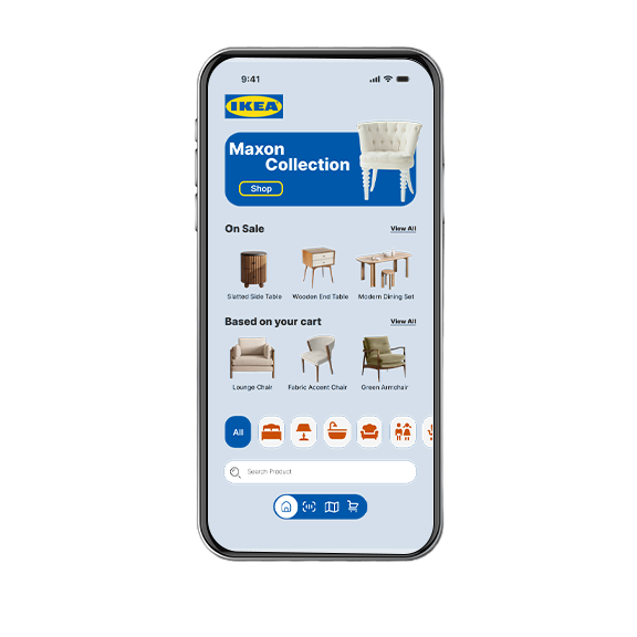
IKEA AR is a brand extension with a unified navigation and visualization ecosystem that helps shoppers move from browsing at home to confidently navigating and buying in-store, without ever breaking their flow.
IKEA
MY ROLE:
Designer, UX Researcher
TIMELINE:
February 2026
IKEA AR is a brand extension with a unified navigation and visualization ecosystem that helps shoppers move from browsing at home to confidently navigating and buying in-store, without ever breaking their flow.
MY CHALLENGE
How might we extend IKEA's existing app experience with three AR behaviors that feel like one connected ecosystem helping shoppers find products in-store, visualize them in their space, and make confident purchase decisions without adding complexity to a feature-heavy app?
MY RESEARCH
User flows, personas, and Ikea consumer research provided valuable insight into how Ikea and their customers operate in the warehouse store. I found these key insights:
- The scan feature requires a barcode. Unlabeled products are unidentifiable.
- Large-format retail creates orientation anxiety in shoppers relying on printed signage in a 300,000 sqft store.
- No way to visualize a product in your space before buying; returns may follow.
MY DECISIONS
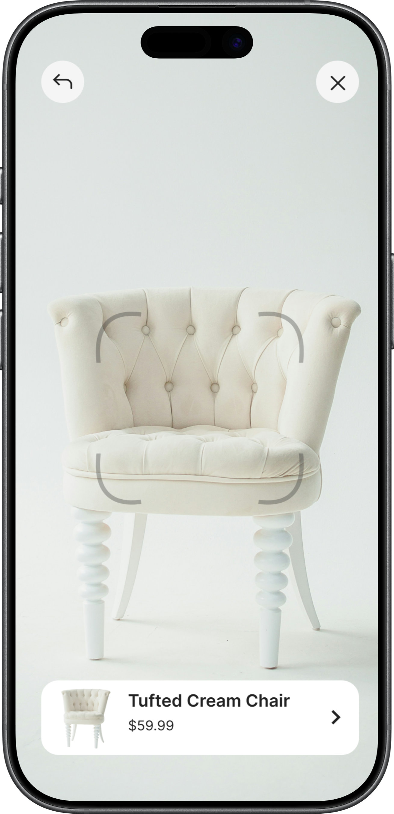
The scan feature requires a barcode. Unlabeled products are unidentifiable.
Using AR to read the product features, rather than a barcode, to definitively identify any product sitting unlabeled on the store floor. Step 1 of a cohesive AR system that recognizes, navigates, and visualizes a product being yours before it hits your home.
Why I designed it this way.
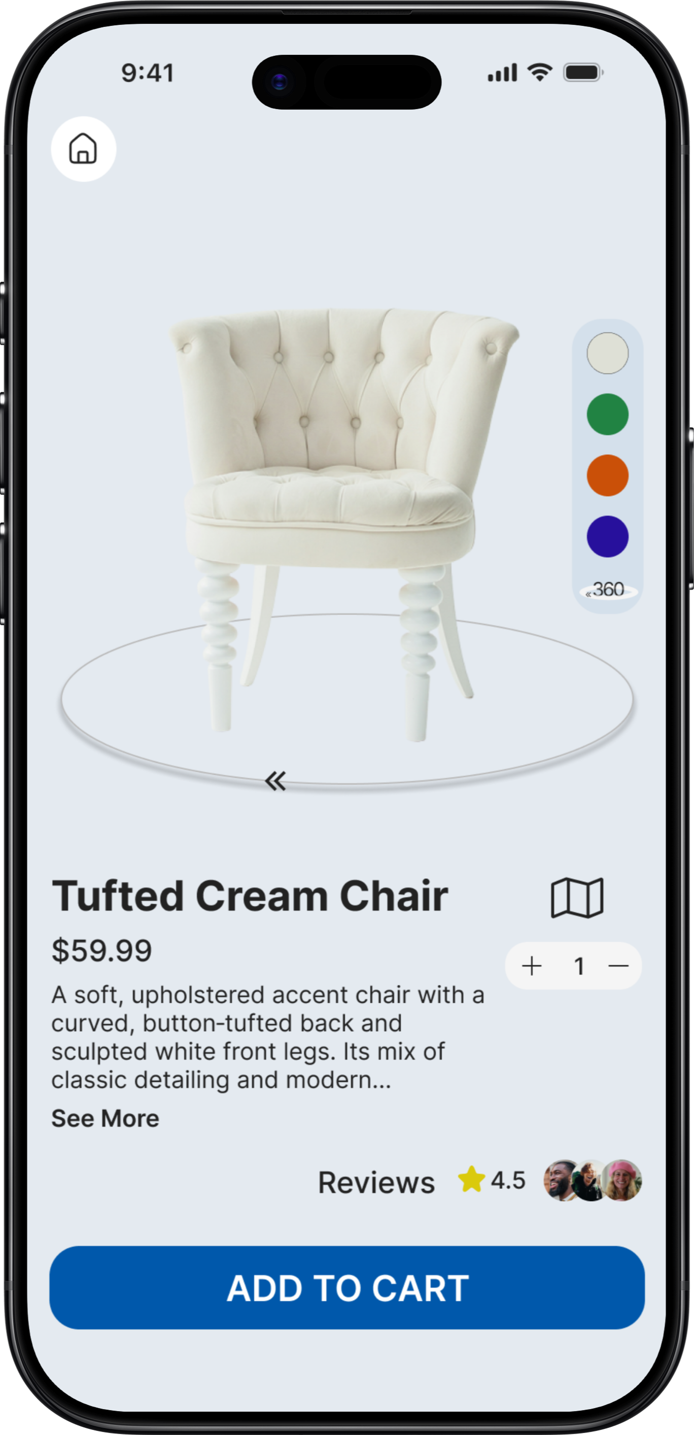
Blending the AR features into a cohesive system, step 1 recognizes and leads to the product description page for futher details with an option to utilize step 2, guided navigation directly to it's in-store home.
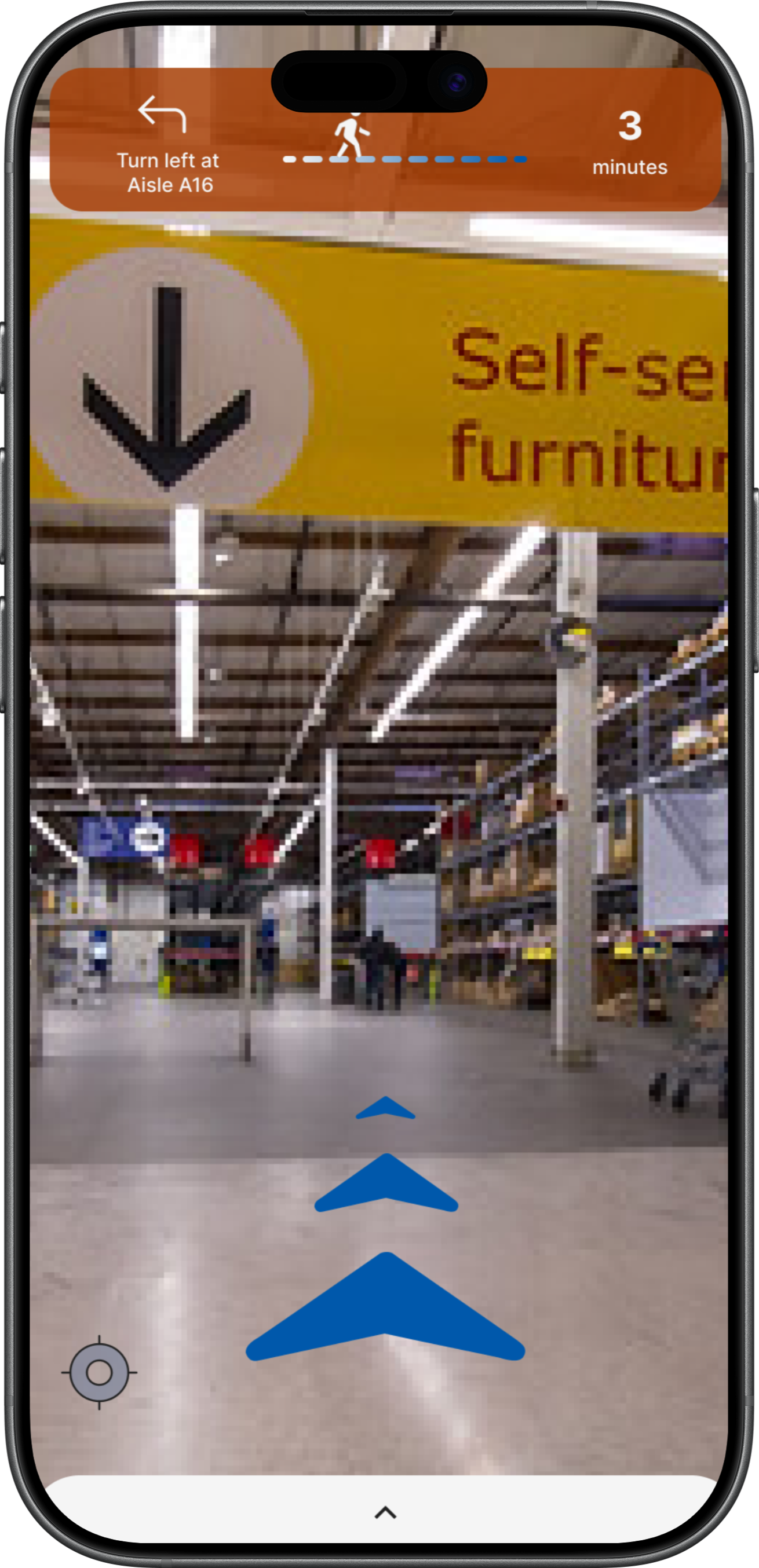
Large-format retail creates orientation anxiety in shoppers relying on printed signage in a 300,000 sq ft store.
I created AR navigation with in-store turn-by-turn directions and an on-screen map to guide shoppers to their favorite products. Step 2 of the cohesive AR system.
Why I designed it this way.
People are used to using GPS directions to navigate in the world, adapting that same idea for navigating inside a large building.
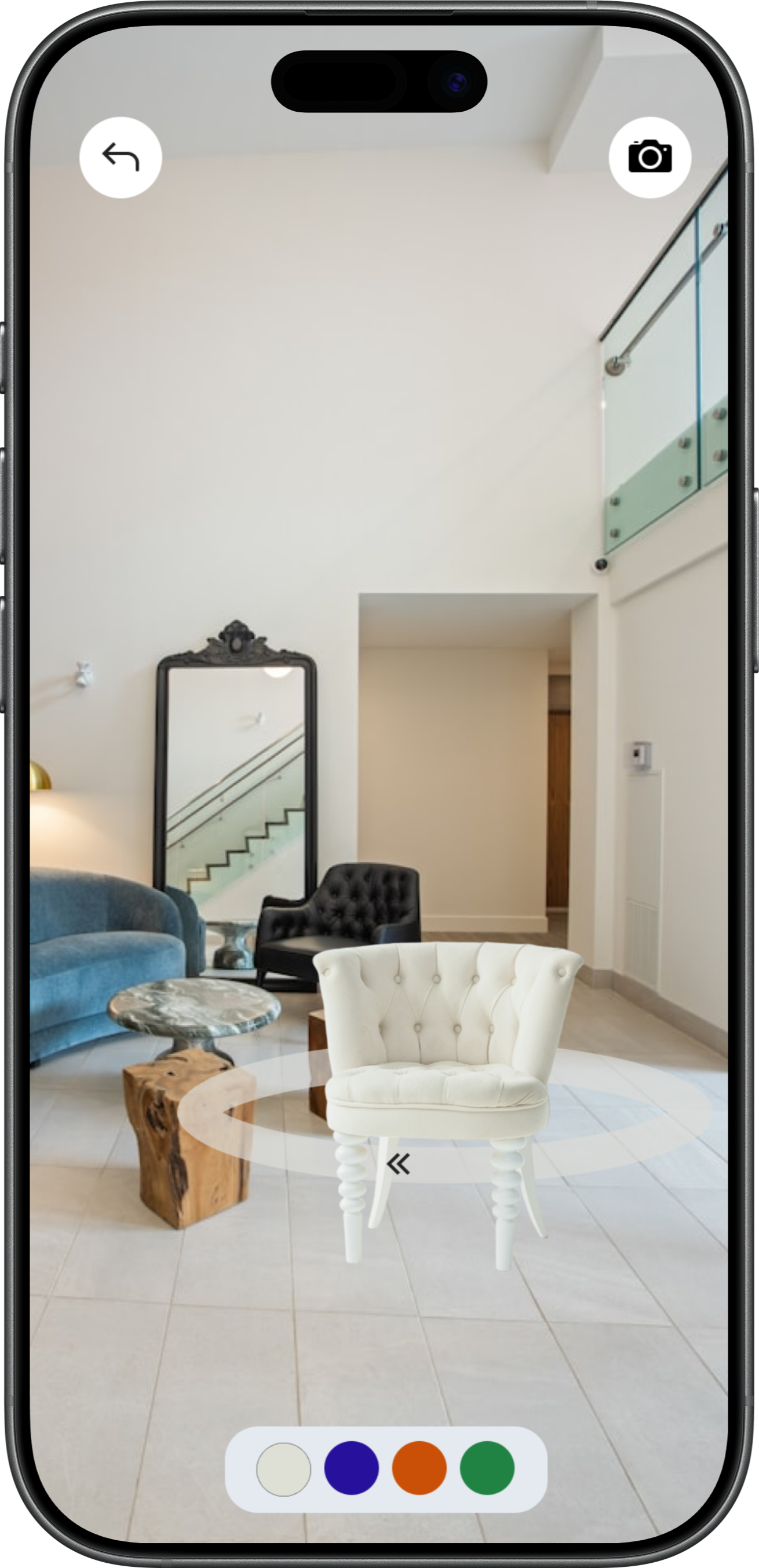
No way to visualize a product in your space before buying; returns follow.
Step 3 of the AR experience removes the worry, and thus, the return. Shoppers see the product sitting in their home before ever going to the store.
Why I designed it this way.
Product photos stage a generic room. Shoppers needed to see it next to their own furniture, in their own space, avoiding disappointment and returns.
MY RETROSPECTIVE
AR changed how I think about contrast. You can't design for a controlled background when the background is the real world. Every UI decision had to hold up against light, dark, and everything in between. That constraint made me a more deliberate designer.
This project also pushed me past the transaction. The view-in-space flow made it obvious that the decision doesn't end when someone puts down their phone and that designing for what comes after is just as important as designing the moment itself.
Designing for an unknown shopper location also sharpened how I think about entry points. I don't know if someone is on their couch or in the store, so the app has to anticipate their needs without making either feel like an afterthought or overwhelming the screen trying to serve everyone at once.
 HOME
WORK
WHY HIRE ME
HOME
WORK
WHY HIRE ME