OnePay
MY ROLE:
Designer, UX Researcher
TIMELINE:
September 2023
OnePay is a redesigned banking app that helps people manage everyday finances with less friction, surfacing payments, transfers, and spending trends exactly where users already expect to find them.
OnePay
MY ROLE:
Designer, UX Researcher
TIMELINE:
September 2023
OnePay is a redesigned banking app that helps people manage everyday finances with less friction, surfacing payments, transfers, and spending trends exactly where users already expect to find them.
MY CHALLENGE
How might we improve OnePay’s app to empower young adults in managing their finances, support saving and spending goals, and enhance their financial well-being?
ONEPAY'S ORIGINAL DESIGN
*Note: OnePay has since updated their app. This case study reflects the version available at the time of this project.
MY RESEARCH
Given the time constraints of this project, I had to find the most effective research method to gather information quickly. I learned 80% of users seek data in familiar locations and all 5 of my testers encountered difficulties in the first 60 seconds.
This is what I learned from my usability interviews:
- Payments weren't discoverable.
- Recurring transfers felt hidden.
- Spending insights were not available.
MY DECISIONS
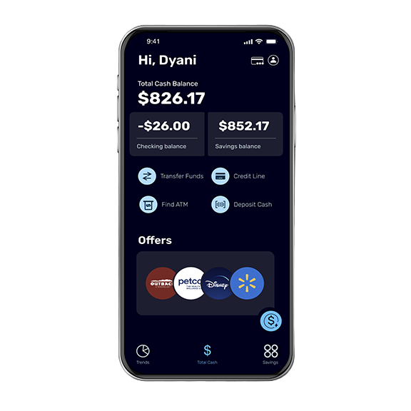
Credit Line Payments weren't discoverable.
I made the top features more discoverable on the homepage.
Why I designed it this way.
Users got frustrated spending a lot of time looking for where to make payments, sometimes abandoning the task altogether.
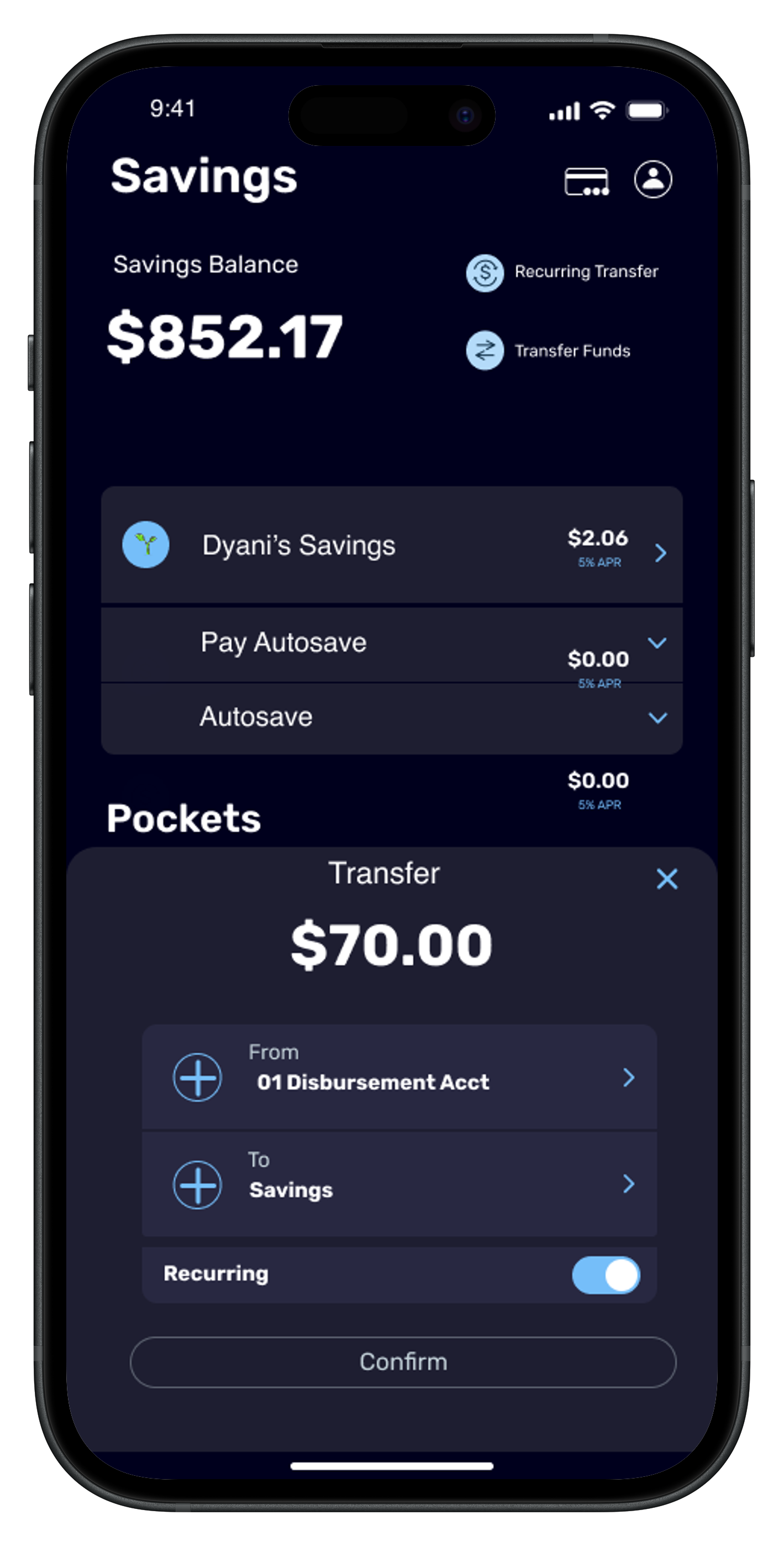
Recurring transfers felt hidden.
I added a dedicated Recurring Transfer entry point directly on the Savings screen where participants searched for it. Sitting next to the standard Transfer option, the toggle pre-set based on which option (Transfer or Recurring Transfer) they tap.
Why I designed it this way.
I followed the participants' lead and dropped the feature into their natural thought process, giving recurring transfer its own entry point right next to the standard one, instead of burying it deeper in the app.
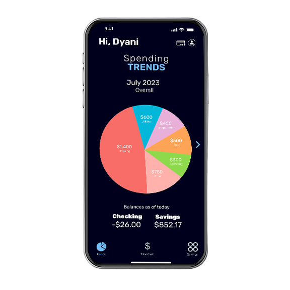
Spending insights were not available.
I designed a new Trends screen, spending broken down by category in a pie chart, that didn't exist in the original app.
Why I designed it this way.
I used the app's original language, the pie chart icon, and repurposed it to house the new Spending Trends screen.
After my redesign, I asked the same 5 participants to perform the same tasks I originally asked them to perform.
They completed the tasks 53% faster, in under 30 seconds, than their pre-redesign attempt.
MY RETROSPECTIVE
This project highlighted how strongly users lean on familiar ways of thinking about money when using new or complex systems. The redesign solved a lot of the "Where do I find this?" problems, but also revealed opportunities to further explore different layouts and prioritization approaches before landing on a final version.
I'd expand usability testing to better understand why certain behaviors surfaced, such as confusion between savings accounts and actionable options. These moments weren't about missing features, they pointed to opportunities to make intent and intuitiveness clearer.
Ultimately, this project reinforced that financial tools, especially for those still building financial independence, are most effective when they reduce decision fatigue by matching the way users already think about money rather than forcing them to adapt to how a system is built.
 HOME
WORK
WHY HIRE ME
HOME
WORK
WHY HIRE ME