Kid Commerce
MY ROLE:
Designer, UX Researcher, Project Manager
TIMELINE:
November 2022 - September 2023
Redesigned May 2026
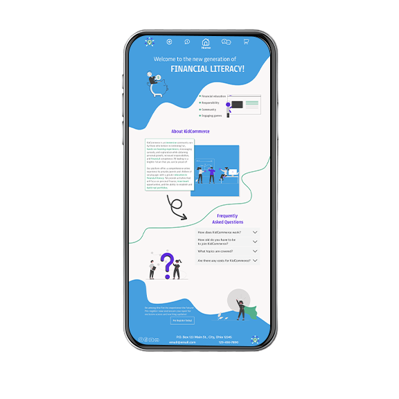
Kid Commerce is a multi-portal financial literacy webapp that helps kids build real money skills through gamified learning while giving parents the transparency to monitor and guide from the sidelines.
Kid Commerce
MY ROLE:
Designer, UX Researcher, Project Manager
TIMELINE:
November 2022 - September 2023
Redesigned May 2026
Kid Commerce is a multi-portal financial literacy webapp that helps kids build real money skills through gamified learning while giving parents the transparency to monitor and guide from the sidelines.
MY CHALLENGE
How might we design an engaging user experience that simultaneously appeals to parents seeking to build generational wealth through financial education for their children AND encourages children to learn financial literacy through gamified experiences?
MY RESEARCH
With a concept so original, I analyized competitors based on separate sections; child-facing, gaming platforms, educational, and financial instituitons. I found color needs to have meaning and the most insight came from the parent-child user interviews I conducted to understand their unique motivations and frustrations. What I found was:
- A single static interface cannot support the needs of both children and parents.
- Individual portals need to adapt to user development.
- Parents need transparency and easy access to information, children need familiar and interesting content.
MY DECISIONS
A single static interface cannot support the needs of both children and parents.
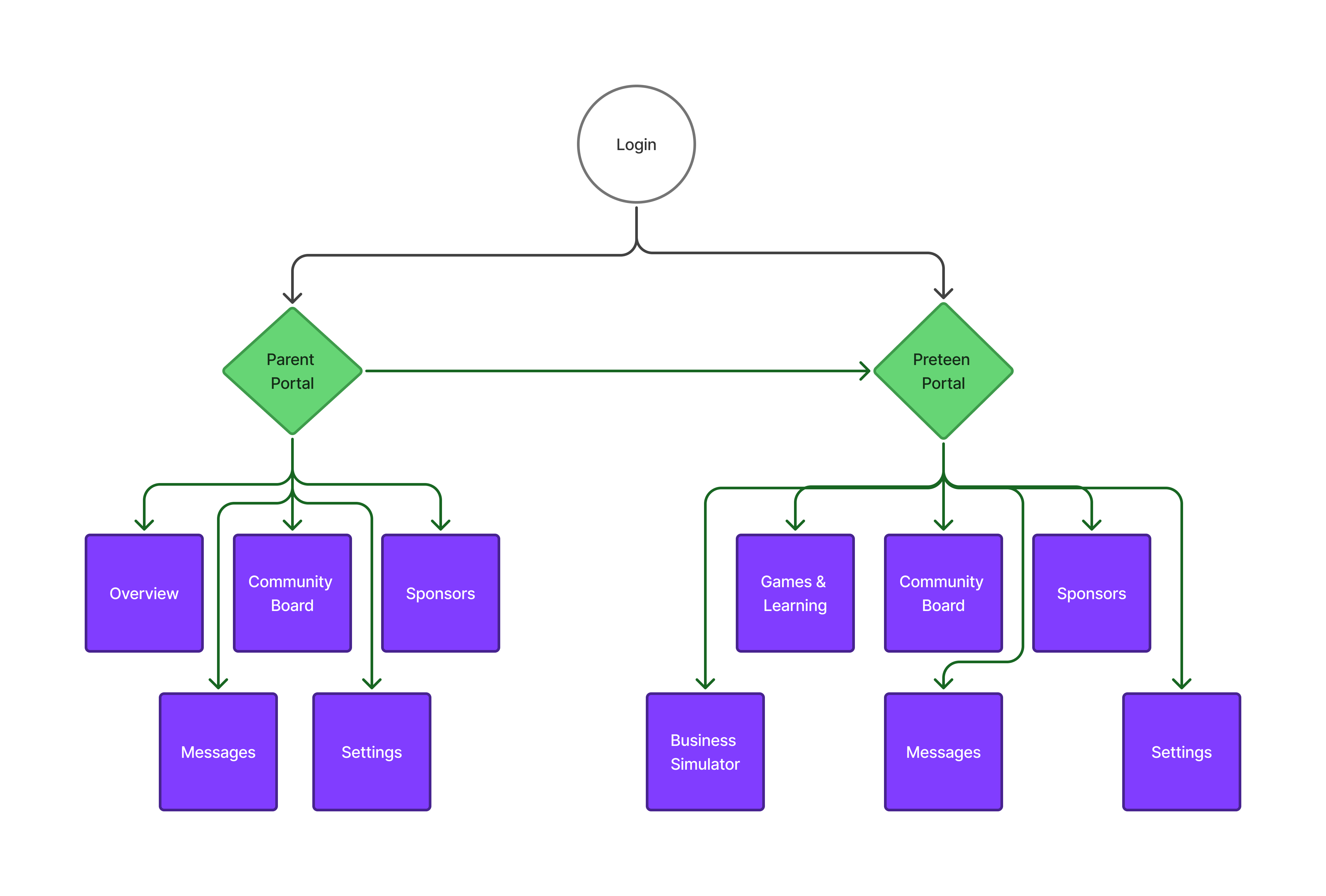
Therefore, I created an ecosystem. Age appropriate portals that both appeal to their development in both aesthetics and content.
Why I designed it this way.
I realized quickly, if I tried to design for everyone, I'd end up designing for no one. Each age group required different content and deserved for that to be honored.
Individual portals need to adapt to user development.
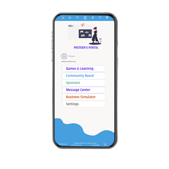
Each portal, from design elements to education and game style, were designed with the users developmental capability and tastes.
Why I designed it this way.
A portal is the whole experience: how competitive it feels, how visual the progress is, how much is spelled out versus implied. Preteens needed a portal built around their instincts, playing up their competitive nature to drive more learning and visual progress helped keep motiviation high.
Parents need transparency and easy access to information, children need familiar and interesting content.
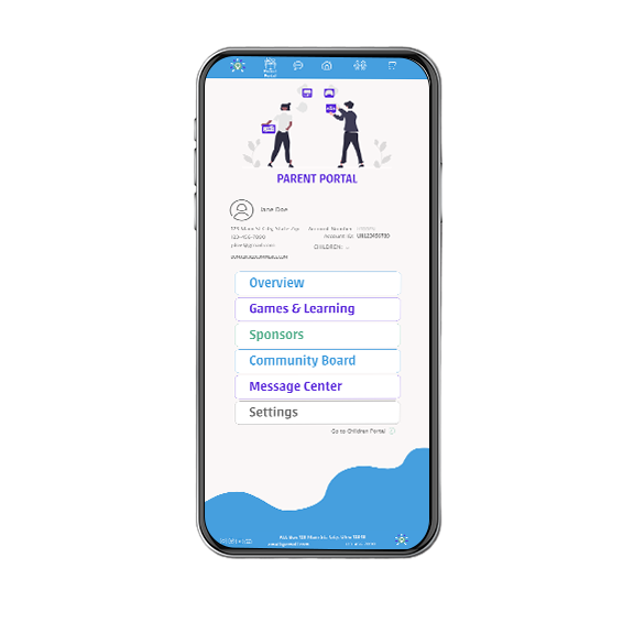
The parent's portal is intentionally quieter. Parent valued company transparency and visibility into their children's activities and progress.
Why I designed it this way.
The parent portal is for monitoring, not engaging.
WHERE IT LANDED
This project was designed in collaboration with a startup founder whose personal circumstances required him to step away. The work shown here reflects a complete design process with research, system architecture, and high-fidelity screens, built without a shipped outcome, which is sometimes exactly how real design work goes.
 HOME
WORK
WHY HIRE ME
HOME
WORK
WHY HIRE ME