The original design flow was confusing and slow, so I redesigned the experience to reduce steps, clarify hierarchy, and support fast, confident banking.
This is how I did it...
This is how I did it...
OnePay
A banking app for saving and spending.
MY ROLE:
Designer, UX Researcher
TIMELINE:
2 weeks
2023
*Note: OnePay has since updated their app. This case study reflects the version available at the time of this project.

OnePay
A banking app for saving and spending.
MY ROLE:
Designer, UX Researcher
TIMELINE:
2 weeks
2023
How might we improve OnePay’s app to empower young adults in managing their finances, support saving and spending goals, and enhance their financial well-being?
Process for OnePay
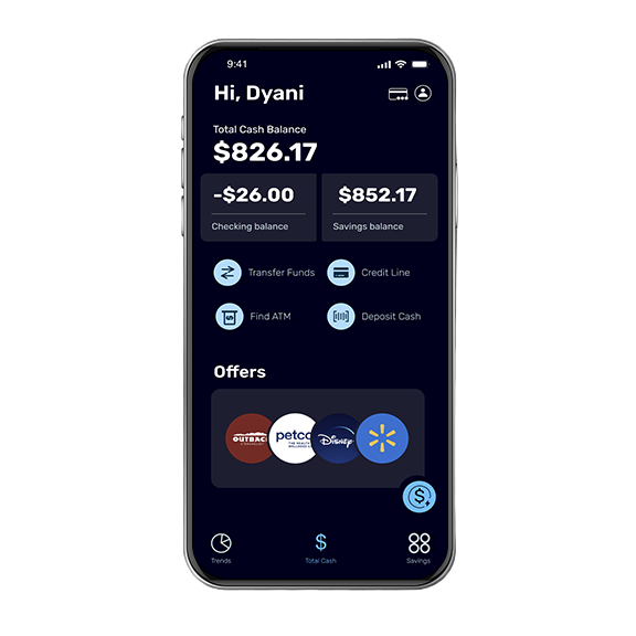
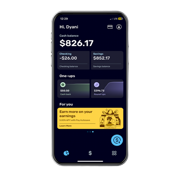
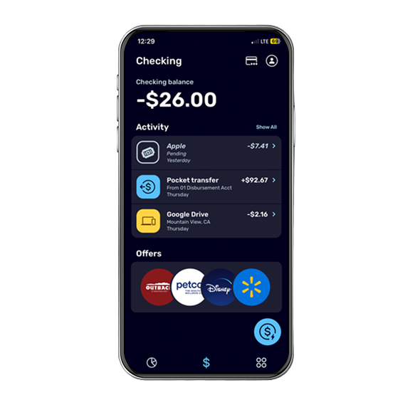
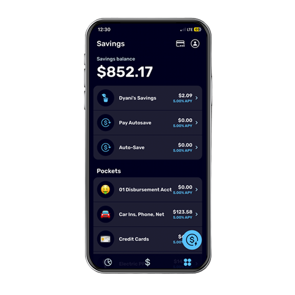
The Original Design
Research
The Missed Opprtunities
1. Users struggled to quickly locate and complete credit line payments which increases the risk of missed or late payments.
2. Important tools like scheduling recurring money transfers were buried, forcing users to search, create their own workaround, or abandon the task altogether.
3. Users lacked insights into spending trends which makes it difficult to plan, adjust habits, or set and keep realistic spending and saving goals.
2. Important tools like scheduling recurring money transfers were buried, forcing users to search, create their own workaround, or abandon the task altogether.
3. Users lacked insights into spending trends which makes it difficult to plan, adjust habits, or set and keep realistic spending and saving goals.
1. Users struggled to quickly locate and complete credit line payments which increases the risk of missed or late payments.
2. Important tools like scheduling recurring money transfers were buried, forcing users to search, create their own workaround, or abandon the task altogether.
3. Users lacked insights into spending trends which makes it difficult to plan, adjust habits, or set and keep realistic spending and saving goals.
2. Important tools like scheduling recurring money transfers were buried, forcing users to search, create their own workaround, or abandon the task altogether.
3. Users lacked insights into spending trends which makes it difficult to plan, adjust habits, or set and keep realistic spending and saving goals.
Discovery
*Note: This research reflects my thinking at the time of this project (2023).
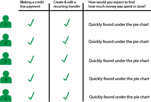
The research findings indicate that a significant majority of users, approximately 80% of users, habitually seek data in familiar locations, such as the pie chart or homepage to identify trends.
The app's navigation structure presents challenges due to concealed and inaccurately labeled sections. Within the initial 60 seconds of interaction, all five interviewees encountered difficulties locating specific tasks or areas.
The app's navigation structure presents challenges due to concealed and inaccurately labeled sections. Within the initial 60 seconds of interaction, all five interviewees encountered difficulties locating specific tasks or areas.
The research shows a significant majority of users, approximately 80% of users, habitually seek data in familiar locations.
The app's navigation structure presents challenges due to concealed and inaccurately labeled sections. Within the initial 60 seconds of interaction, all five interviewees encountered difficulties locating specific tasks or areas.
The app's navigation structure presents challenges due to concealed and inaccurately labeled sections. Within the initial 60 seconds of interaction, all five interviewees encountered difficulties locating specific tasks or areas.


What the Research Told Me
Clearing the design tensions:
1. The system needs to start helping immediately without asking users what they need.
2. Switching between methods needs to be fast and not interrupt their progress.
3. Users need to be able to step in, change, or stop what’s happening at any time.
4. Full control over expression and information.
1. The system needs to start helping immediately without asking users what they need.
2. Switching between methods needs to be fast and not interrupt their progress.
3. Users need to be able to step in, change, or stop what’s happening at any time.
4. Full control over expression and information.
Within the first 60 seconds of interaction, users defaulted to their familiar behavior patterns and when their expectations were not met, task completion broke down.
1. Payments weren't discoverable.
2. Recurring transfers felt hidden.
3. Spending insights were not available.
1. Payments weren't discoverable.
2. Recurring transfers felt hidden.
3. Spending insights were not available.
Within the first 60 seconds of interaction, users defaulted to their familiar behavior patterns and when their expectations were not met, task completion broke down, leaving some tasks never completed.
- Payments weren't discoverable.
- Recurring transfers felt hidden.
- Spending insights were not available.
- Payments weren't discoverable.
- Recurring transfers felt hidden.
- Spending insights were not available.
So..
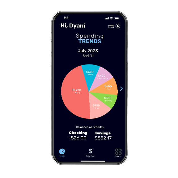
How might we strategically integrate trend data and enhance navigational efficiency to address usability issues and enhance the overall user interface of the application?
Inside My Design Thinking
Sketches and Wireframes
These sketches show my internal design dialogue with all the questions, doubts, and pivots that shaped the final solution.
The sketches show my internal design dialogue with all the questions, doubts, and pivots that shaped the final solution.
Final Outcome
My Retrospective
This project highlighted how strongly users lean on familiar ways of thinking about money when using new or complex systems. The redesign solved a lot of the "Where do I find this?" problems, but also revealed opportunities to further explore different layouts and prioritization approaches before landing on a final version.
I'd expand usability testing to better understand why certain behaviors surfaced, such as confusion between savings accounts and actionable options. These moments weren't about missing features, they pointed to opportunities to make intent and intuitiveness clearer.
Ultimately, this project reinforced that financial tools, especially for those still building financial independence, are most effective when they reduce decision fatigue by matching the way users already think about money rather than forcing them to adapt to how a system is built.
I'd expand usability testing to better understand why certain behaviors surfaced, such as confusion between savings accounts and actionable options. These moments weren't about missing features, they pointed to opportunities to make intent and intuitiveness clearer.
Ultimately, this project reinforced that financial tools, especially for those still building financial independence, are most effective when they reduce decision fatigue by matching the way users already think about money rather than forcing them to adapt to how a system is built.
This project showed how strongly users rely on familiar mental models when navigating financial tools. The redesign improved discoverability and revealed opportunities to refine layout, clarity, and intent through deeper usability testing. Ultimately, aligning the interface with users' natural ways of thinking proved key to reducing decision fatigue.